a blog by Peter Leonard


One of the projects I’m working on is a computational analysis of a long-running American fashion magazine, Vogue. First published in 1892, there are over 2,700 issues and 440,000 individual pages in this corpus. This kind of scale makes traditional ‘close reading’ time-consuming — both the textual and the visual richness of the magazine can overwhelm you.
So I’m working on a few different ways to visualize continuity and change over time in this archive. One approach is to see how the covers of the magazine have developed. Covers are interesting at least in part because they have a kind of indexical relationship to all the pages in that issue — they represent the contents of the volume, and in many cases try to entice the consumer to buy the issue at a newsstand.
Of course, with nearly 3,000 covers in the collection, we need to do some reduction in scope to get any sense of visual progression — our monitors aren’t large enough to look at all the covers at once! What I decided to do was to create a “decennial sampling” of Vogue covers — that is, all the covers in one year, every ten years. I then overlaid each of the covers for a chosen year and generated a visual “average” (mean RGB values for each pixel). The result is this:
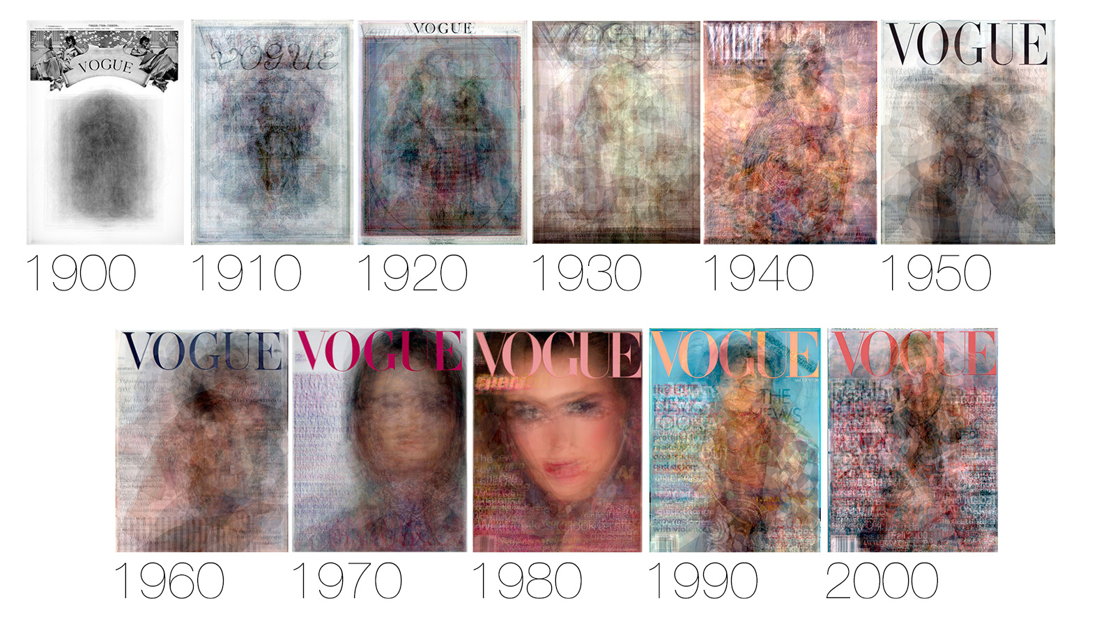
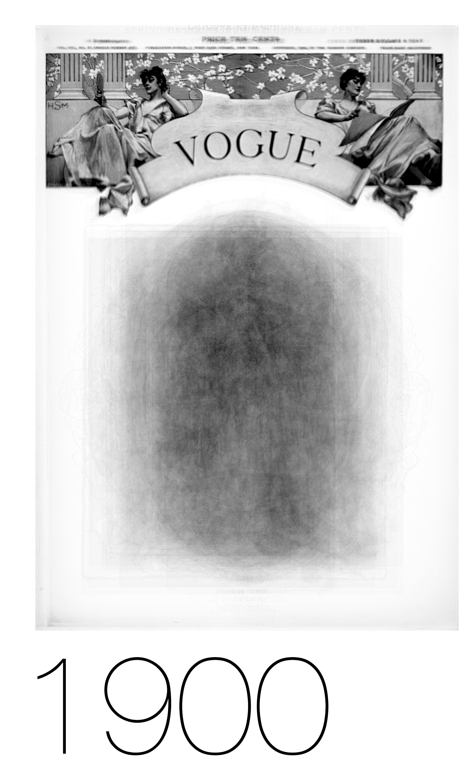
Although this visualization was inspired by the work of Lev Manovich (CUNY), I should point out that this is a small-scale, hand-crafted graphic with substantial amount of manual labor. I wanted to get the covers to align exactly, where applicable, so that the repetition of static elements in the layout generated the strongest possible pattern. For example the first few decades of covers had a running header across the top of the cover, with an illustration lower down being the only dynamic element. The result of that pattern is a fuzzy blur down below, with a clearly visible header up top:
Getting this precise alignment would have been difficult if I relied upon the raw data itself, given the variation in gutters (bound and unbound copies, etc) and scanning/photography setups used to compile the archive. So I cheated a bit and hand-aligned these layers in Photoshop prior to generating the pixel average.
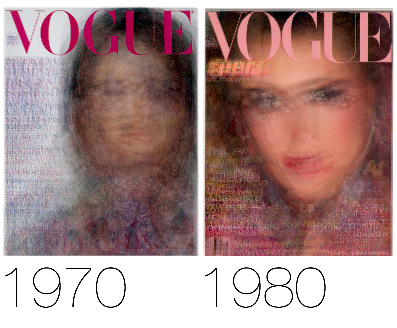
Speaking of constant images, one of the things that usually jumps out at people when they look at this progression of covers are the years 1970 and 1980. Though clearly comprised of different covers, the net effect of the average pixel visualization is a ghostly, Platonic cover model who seems to be almost the same in her positioning, gaze, and even head angle:
This stands in marked contrast to earlier decades, where we can’t seem to divine any clear pattern to the cover designs themselves:
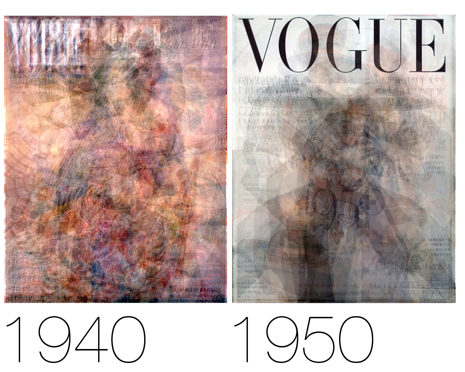
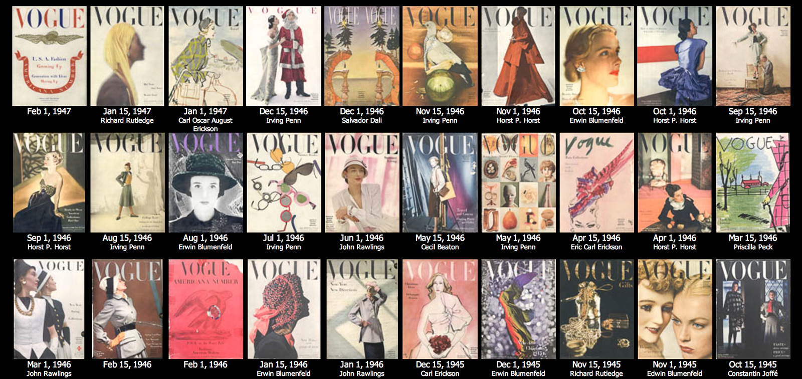
These cover photographs and illustrations from 1940 and 1950 were sufficiently diverse and distinct as to preclude any clear pattern from emerging, unlike the standardized model pose of the 1970 and 1980 data. In fact, digging into the covers themselves, we see the names of famous avant-garde artists emerge — distinctive, individual visions for the cover of Vogue that stand in marked contrast to the face-only covers later on. In this sample from 1946, you can see Salvador Dalí, Irving Penn, and Horst Horst, to name a few:
So what we’re seeing here is the way that averaged pixel values show us the kind of “visual rut” that Vogue had fallen into in the 1970s and 80s, unlike the individualistic, artistic covers that characterized the mid-Century era.
The story of why those later covers look the way they do is complicated, and would deserve its own post. But the regularity of those later covers is certainly bound up with the changes that Grace Mirabella wanted to make when she became the Editor-in-Chief, and are arguably part of the incredible success that brought to the magazine. Witness the change in circulation during this period:
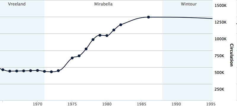
So these ‘boring’ covers may represent æsthetic failure, but they also symbolize mass-market success.